Open Me
CropLife America
"Tell Me More"
MICROSITE DESIGN
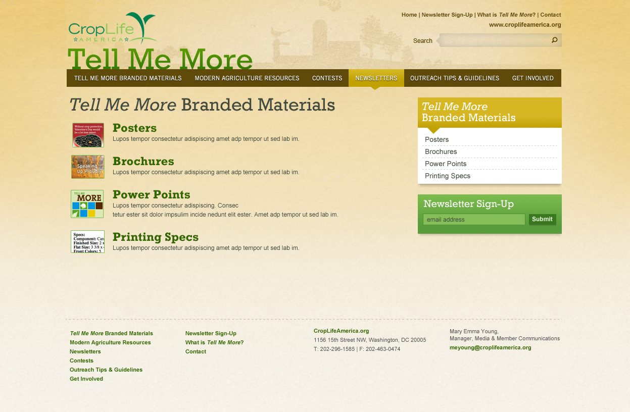
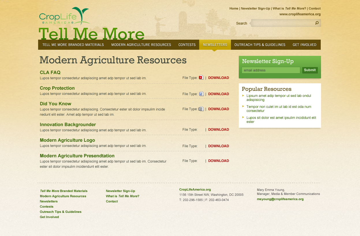
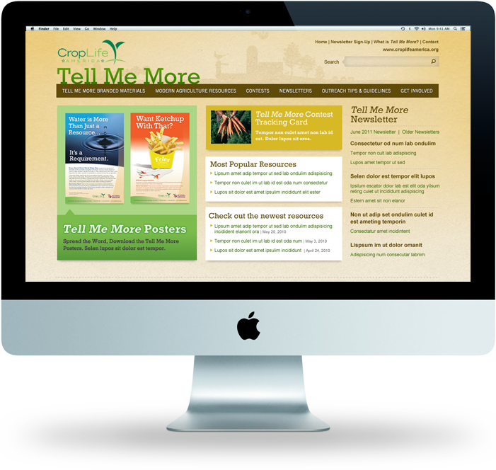
The microsite was designed as a repository for a collection of print and online resources for the client's Tell Me More campaign.
The visual design is purposely kept simple, focusing on the corporate brand colors and type face. We highlighted images of the resources and pulled a few select visual details from the main site to give it visual interest and continuity.
We worked with the client to keep the information architecture and the user experience very simple. We highlighted certain resources on the homepage and then used simple lists of resources on the interior pages. Organizing it this way allows the user to get in and out with the resources they need in just a few minutes.
Project Overview:
| CONTRIBUTIONS: Visual Design, Information Architecture and Cross Branding |
 PROJECT TYPE: PROJECT TYPE: WordPress resource Database based on the exisiting Corporate site |
 Designed in collaboration with OmniStudio, Washington DC Designed in collaboration with OmniStudio, Washington DC |